
Sometimes a design or a collection just spills out of you with the greatest of ease. Other times it’s laboured and hard work. If a design becomes laboured and I feel that I have to keep redoing it, I know from experience it’s going to be a dud! I’m thrilled to launch our new collection Zephyr, (thanks to Katy Easey marketing and PR for doing the naming), and I’m pleased to say it was one of those collections that evolved into ‘rightness’ in the blink of an eye. From sketches I did on holiday to doodling in the studio with Indian ink. This was a collection that was borne of just enjoying painting and creating. It makes me smile that I kept remembering my old boss, Antony Little, telling me to go and design something I would like in my own house, when I worked for him and was struggling to fit in. Out of that discussion the seeds of their Lamorna collection were sown, and it was the same principle that I applied to this collection. I hope you like it ….


The lovely Dashi design was a tiny coordinate I had been playing around with that was loosely based on stitches. For those of you who don’ t know, my background was in embroidery, which is something I still love, and do whenever I get the chance, Its funny as sometimes the designs with the least in them are the most successful. I think Dashi will be one of those designs. It is timeless and really easy to use.


I did the original artwork for Fern while I was sitting in the sunshine in France; all was peaceful after lunch on our campsite. The kids had taken themselves off to the pool, Mr H was snoozing in the hammock and I sat under a tree and doodled away; drawing some stylised fern shapes based on something growing in the hedge!
I really like hand painting my artwork and do as little as possible with it once its painted, you can see from the print on fabric that all of my wobbly brush marks are still there, you can also see when i’ve loaded the brush again by the heavier colour.


Izzi (above) is a really pretty and airy, slightly graphic, floral. It is in fact based on our very popular Suzi design but printed in reverse in softer colours. Its very light and breezy and looks totally different to Suzi.


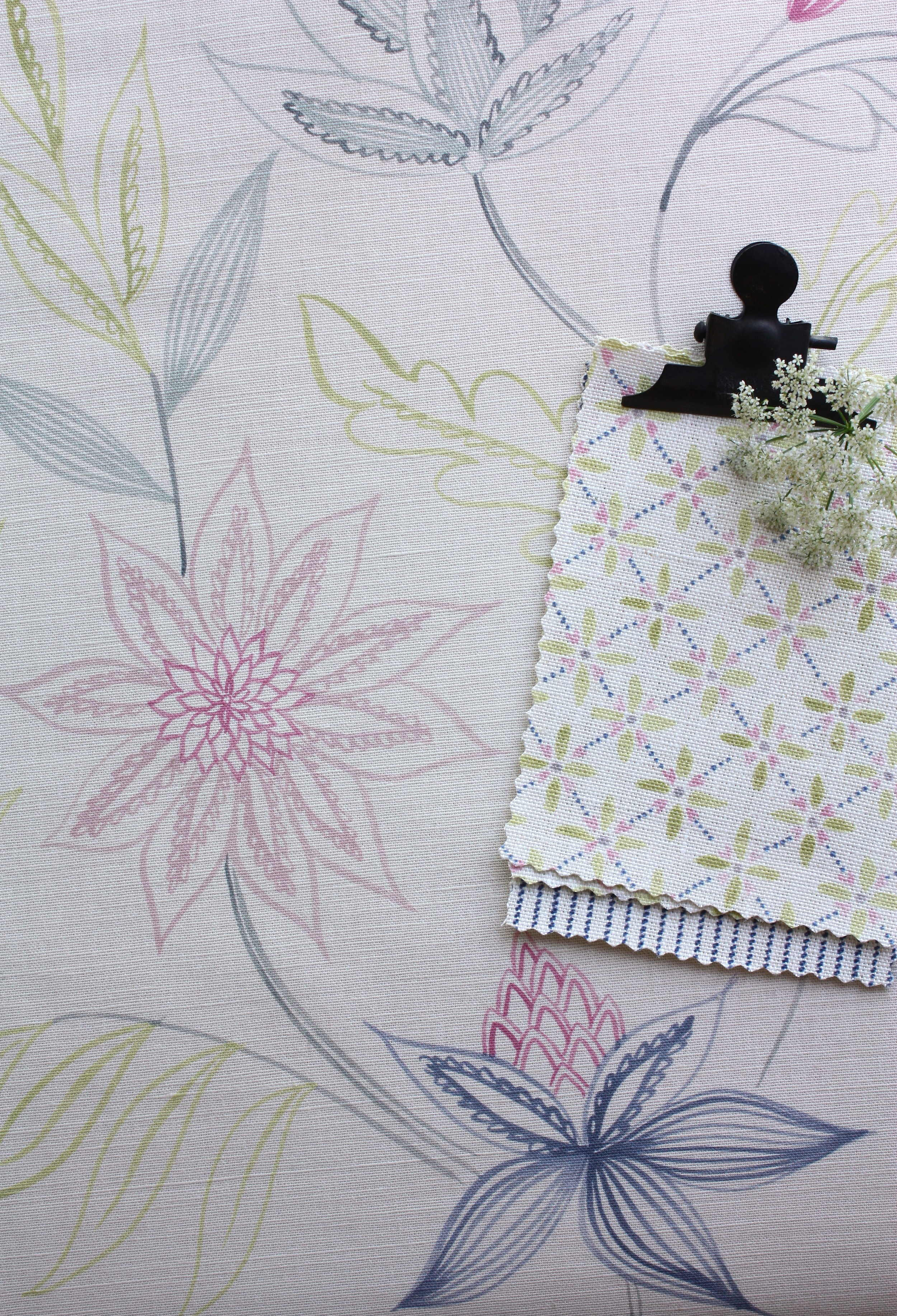
Flora (above right) is a really pretty and quite large, meandering trail design. it comes as a single colour and a multicolour, I was just going to print it as a single colour, a little bit like a modern take on a toile, when my daughter Bella said she would really like to see what it looked like with pink flowers and blue leaves so we did a couple of multicolours too, including her pink and ink version (see below ) and the citrine and grey version above.
Zia (above left), is a really lovely little hand painted geometric. Im not very good with what I would call hard geometrics, I like things to look a bit soft and wobbly. You can watch me putting the finishing touches to Zia design here . You can also listen to the radio 4 news which is on in the background!)

Izzi is a really pretty and airy slightly graphic floral. it is in fact based on our very popular Suzi design, but printed in reverse in softer colours. It is very light and breezy and looks totally different to Suzi.